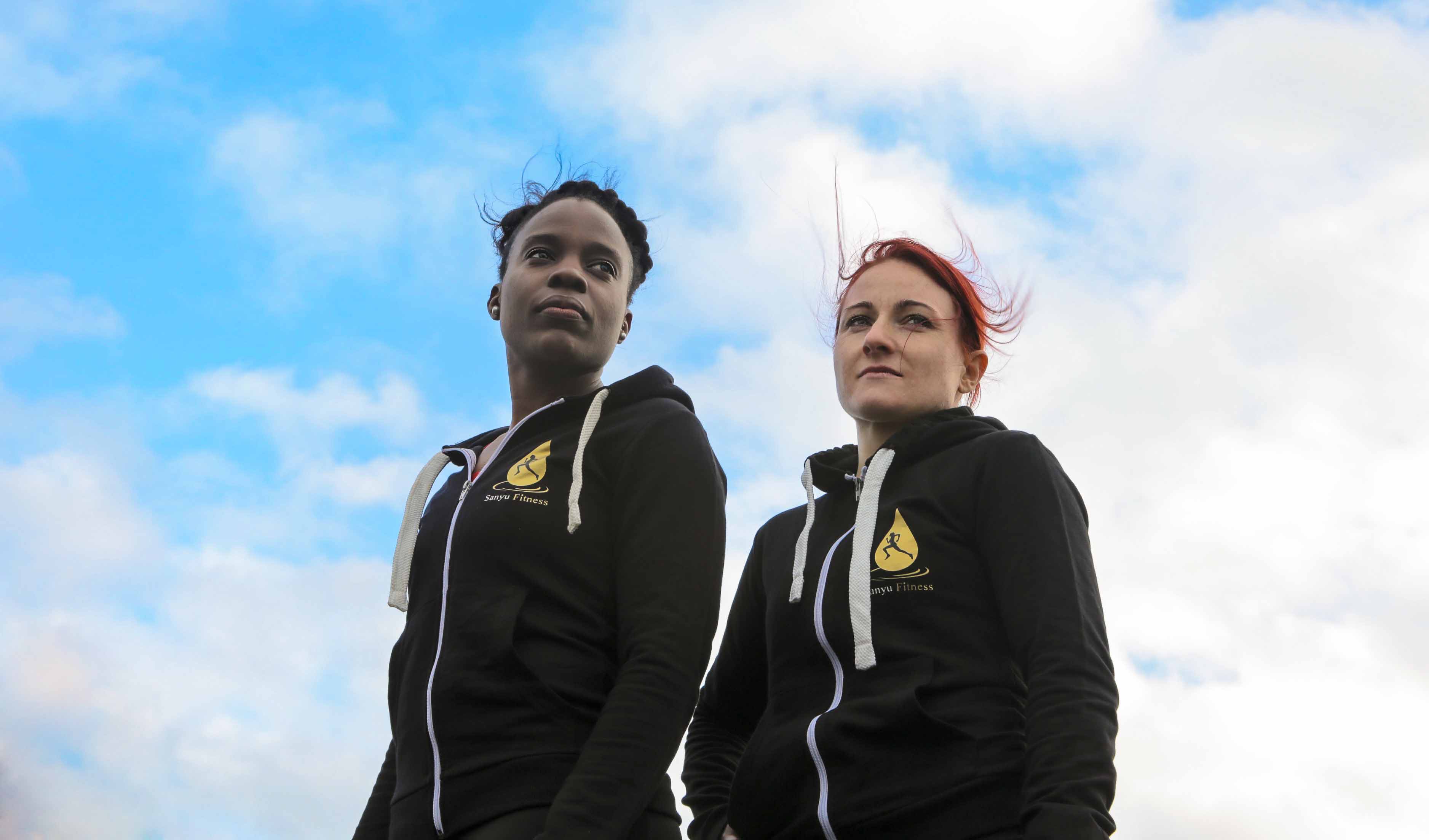
Sanyu Fitness is a personal training company that have a team of PT's that go and work privately with their clients. The company realised the opportunity to expand into supplements. Also since they were having a number of PT's joining there company they wanted to create an identity.
ChallengeI had previously worked with them to design their current logo and other print materials, my creative control was very limited as they had a clear vision and I was more of technical designer just bringing to life their ideas. Now they needed a proper brand identity service, in order to deliver this effectively I had to do a little bit of research into the company's target audience and ask the directors what their goals were.
ActionsI redesigned the website and built a blog on top of a CMS so that they could upload posts regularly. As for the online shop, I had to take a fresh approach as there are many supplement brands out there that can be easily mistaken for each other. Since Sanyu is meant to be a exclusive private company, I thought about this and integrated it with the packaging design.
To view the Sanyu Fitness website click here.
-
The picture above was the first logo I designed for them. The whole idea behind it is a reflection (silhouette) of a female in sweat droplet.
-
Soon after the client insisted that I retweek the logo to look exactly how they want it. This was the result, to my surprise the director thought this looked much better than the one I designed for him earlier. Maybe they just wanted more of an input on the design, but it has it's good parts. A few months after, I was approached once more this time for a website redesign, packaging design and various print design materials.
-
This time I took a much more structured approach on this project as the client was heavily relying on my expertise this time around.
-
-
We agreed this color scheme brought out the excitement emotion adn that's the emotion they want to bring out in their website visitors.